Matplotlib#
Matplotlib是Python的二维绘图库,用于生成符合出版质量或跨平台交互环境的各类图形。
准备数据#
一维数据#
import numpy as np
x = np.linspace(0, 10, 100)
y = np.cos(x)
z = np.sin(x)
二维数据或图片#
data = 2 * np.random.random((10, 10))
data2 = 3 * np.random.random((10, 10))
Y, X = np.mgrid[-3:3:100j, -3:3:100j]
U = -1 - X**2 + Y
V = 1 + X - Y**2
绘制图形#
导入库#
import matplotlib.pyplot as plt
%matplotlib inline
画布#
fig = plt.figure()
<Figure size 640x480 with 0 Axes>
fig2 = plt.figure(figsize=plt.figaspect(2.0))
<Figure size 400x800 with 0 Axes>
坐标轴#
图形是以坐标轴为核心绘制的,大多数情况下,子图就可以满足需求。子图是栅格系统的坐标轴。
ax1 = fig.add_subplot(221) # row-col-num
ax3 = fig.add_subplot(212)
fig3, axes = plt.subplots(nrows=2, ncols=2)
fig4, axes2 = plt.subplots(ncols=3)
fig.add_axes(ax1)
<Axes: >
绘图例程#
一维数据#
fig, ax = plt.subplots()
lines = ax.plot(x, y) # 用线或标记连接点
ax.scatter(x, y) # 缩放或着色未连接的点
<matplotlib.collections.PathCollection at 0x7f270929e570>
axes[0, 0].bar([1, 2, 3], [3, 4, 5]) # 绘制柱状图
<BarContainer object of 3 artists>
axes[1, 0].barh([0.5, 1, 2.5], [0, 1, 2]) # 绘制水平柱状图
<BarContainer object of 3 artists>
axes[1, 1].axhline(0.45) # 绘制与轴平行的横线
<matplotlib.lines.Line2D at 0x7f270929d9a0>
axes[0, 1].axvline(0.65) # 绘制与轴垂直的竖线
<matplotlib.lines.Line2D at 0x7f27091374d0>
ax.fill(x, y, color="blue") # 绘制填充多边形
[<matplotlib.patches.Polygon at 0x7f270919c410>]
ax.fill_between(x, y, color="yellow") # 填充 y 值和 0 之间
<matplotlib.collections.FillBetweenPolyCollection at 0x7f270922f380>
向量场#
axes[0, 1].arrow(0, 0, 0.5, 0.5) # 为坐标轴添加箭头
<matplotlib.patches.FancyArrow at 0x7f2709309910>
axes[1, 1].quiver(y, z) # 二维箭头
<matplotlib.quiver.Quiver at 0x7f270919ce60>
axes[0, 1].streamplot(X, Y, U, V) # 二维箭头
<matplotlib.streamplot.StreamplotSet at 0x7f270903cce0>
数据分布#
ax1.hist(y) # 直方图
(array([26.,  8.,  7.,  6.,  6.,  6.,  6.,  7.,  8., 20.]),
 array([-9.99947166e-01, -7.99952450e-01, -5.99957733e-01, -3.99963016e-01,
        -1.99968300e-01,  2.64169119e-05,  2.00021134e-01,  4.00015850e-01,
         6.00010567e-01,  8.00005283e-01,  1.00000000e+00]),
 <BarContainer object of 10 artists>)
ax3.boxplot(y) # 箱形图
{'whiskers': [<matplotlib.lines.Line2D at 0x7f2709178e30>,
  <matplotlib.lines.Line2D at 0x7f2708f03140>],
 'caps': [<matplotlib.lines.Line2D at 0x7f2708f033e0>,
  <matplotlib.lines.Line2D at 0x7f2708f03710>],
 'boxes': [<matplotlib.lines.Line2D at 0x7f27091c3ef0>],
 'medians': [<matplotlib.lines.Line2D at 0x7f2708f03a10>],
 'fliers': [<matplotlib.lines.Line2D at 0x7f2708f03cb0>],
 'means': []}
ax3.violinplot(z) # 小提琴图
{'bodies': [<matplotlib.collections.FillBetweenPolyCollection at 0x7f2709178530>],
 'cmaxes': <matplotlib.collections.LineCollection at 0x7f27091633b0>,
 'cmins': <matplotlib.collections.LineCollection at 0x7f2708f44980>,
 'cbars': <matplotlib.collections.LineCollection at 0x7f2708f00f20>}
二维数据或图片#
fig, ax = plt.subplots()
axes2[0].pcolor(data2) # 二维数组伪彩色图
<matplotlib.collections.PolyQuadMesh at 0x7f2708f790d0>
axes2[0].pcolormesh(data) # 二维数组等高线伪彩色图
<matplotlib.collections.QuadMesh at 0x7f2708fa9310>
CS = plt.contour(Y, X, U) # 等高线图
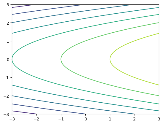
axes2[2] = ax.clabel(CS) # 等高线图标签
图形解析与工作流#
图形解析#
工作流#
Matplotlib 绘图的基本步骤:
Step 1 准备数据
Step 2 创建图形
Step 3 绘图
Step 4 自定义设置
Step 5 保存图形
Step 6 显示图形
import matplotlib.pyplot as plt
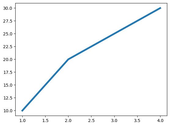
x = [1, 2, 3, 4] # Step 1
y = [10, 20, 25, 30]
fig = plt.figure() # Step 2
<Figure size 640x480 with 0 Axes>
ax = fig.add_subplot(111) # Step 3
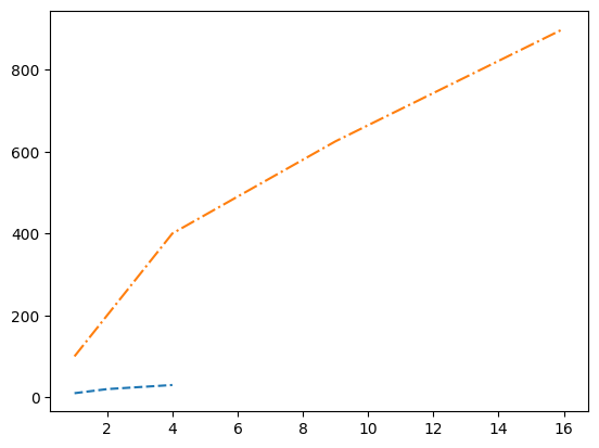
ax.plot(x, y, color="lightblue", linewidth=3) # Step 3, 4
[<matplotlib.lines.Line2D at 0x7f2708e2fe00>]
ax.scatter([2, 4, 6], [5, 15, 25], color="darkgreen", marker="^")
<matplotlib.collections.PathCollection at 0x7f2708f45bb0>
ax.set_xlim(1, 6.5)
(1.0, 6.5)
plt.savefig("../_tmp/plt_savefig.png") # Step 5
<Figure size 640x480 with 0 Axes>
plt.show() # Step 6
自定义图形#
颜色、色条与色彩表#
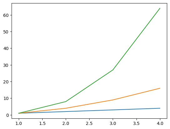
plt.plot(x, x, x, [i**2 for i in x], x, [i**3 for i in x])
[<matplotlib.lines.Line2D at 0x7f2708ea2690>,
 <matplotlib.lines.Line2D at 0x7f2708ea26c0>,
 <matplotlib.lines.Line2D at 0x7f2708ea18e0>]
ax.plot(x, y, alpha=0.4)
[<matplotlib.lines.Line2D at 0x7f2708c349b0>]
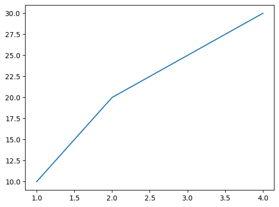
ax.plot(x, y, c="k")
[<matplotlib.lines.Line2D at 0x7f2708e2d220>]
标记#
fig, ax = plt.subplots()
ax.scatter(x, y, marker=".")
<matplotlib.collections.PathCollection at 0x7f2708e1b7a0>
ax.plot(x, y, marker="o")
[<matplotlib.lines.Line2D at 0x7f2708cadbb0>]
线型#
plt.plot(x, y, linewidth=4.0)
[<matplotlib.lines.Line2D at 0x7f2708cce840>]
plt.plot(x, y, ls="solid")
[<matplotlib.lines.Line2D at 0x7f2708f919a0>]
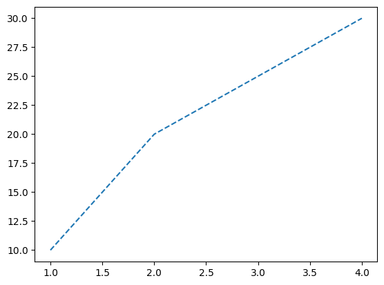
plt.plot(x, y, ls="--")
[<matplotlib.lines.Line2D at 0x7f2708bbecf0>]
plt.plot(x, y, "--", [i**2 for i in x], [i**2 for i in y], "-.")
[<matplotlib.lines.Line2D at 0x7f2708c16990>,
 <matplotlib.lines.Line2D at 0x7f2708a3ef60>]
plt.setp(lines, color="r", linewidth=4.0)
[None, None]
文本与标注#
ax.text(1, -2.1, "Example Graph", style="italic")
Text(1, -2.1, 'Example Graph')
ax.annotate(
    "Sine",
    xy=(8, 0),
    xycoords="data",
    xytext=(10.5, 0),
    textcoords="data",
    arrowprops=dict(arrowstyle="->", connectionstyle="arc3"),
)
Text(10.5, 0, 'Sine')
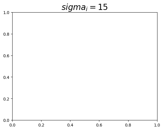
数学符号#
plt.title(r"$sigma_i=15$", fontsize=20)
Text(0.5, 1.0, '$sigma_i=15$')
尺寸限制、图例和布局#
尺寸限制与自动调整
ax.margins(x=0.0, y=0.1) # 添加内边距
ax.axis("equal") # 将图形纵横比设置为 1
(np.float64(1.0), np.float64(4.0), np.float64(8.0), np.float64(32.0))
ax.set(xlim=[0, 10.5], ylim=[-1.5, 1.5]) # 设置 x 轴与 y 轴的限制
[(0.0, 10.5), (-1.5, 1.5)]
ax.set_xlim(0, 10.5) # 设置 x 轴的限制
(0.0, 10.5)
图例
ax.set(title="An Example Axes", ylabel="Y-Axis", xlabel="X-Axis") # 设置标题与 x、y 轴的标签
[Text(0.5, 1.0, 'An Example Axes'),
 Text(4.444444444444445, 0.5, 'Y-Axis'),
 Text(0.5, 4.444444444444445, 'X-Axis')]
ax.legend(loc="best") # 自动选择最佳的图例位置
/tmp/ipykernel_21260/2554463562.py:1: UserWarning: No artists with labels found to put in legend.  Note that artists whose label start with an underscore are ignored when legend() is called with no argument.
  ax.legend(loc="best")  # 自动选择最佳的图例位置
<matplotlib.legend.Legend at 0x7f2708ae3f50>
标记
ax.xaxis.set(ticks=range(1, 5), ticklabels=[3, 100, -12, "foo"]) # 手动设置 X 轴刻度
[[<matplotlib.axis.XTick at 0x7f2708c70380>,
  <matplotlib.axis.XTick at 0x7f2708fd2b70>,
  <matplotlib.axis.XTick at 0x7f27092c7770>,
  <matplotlib.axis.XTick at 0x7f2708c73d70>],
 [Text(1, 0, '3'), Text(2, 0, '100'), Text(3, 0, '-12'), Text(4, 0, 'foo')]]
ax.tick_params(axis="y", direction="inout", length=10) # 设置 Y 轴长度与方向
子图间距
fig3.subplots_adjust(
    wspace=0.5, hspace=0.3, left=0.125, right=0.9, top=0.9, bottom=0.1
)  # 调整子图间距
fig.tight_layout() # 设置画布的子图布局
Ignoring fixed y limits to fulfill fixed data aspect with adjustable data limits.
坐标轴边线
ax1.spines["top"].set_visible(False) # 隐藏顶部坐标轴线
ax1.spines["bottom"].set_position(("outward", 10)) # 设置底部边线的位置为 outward
保存#
savefig函数
plt.savefig("../_tmp/plt_savefig.png") # 保存画布
<Figure size 640x480 with 0 Axes>
plt.savefig("../_tmp/plt_savefig_transparent.png", transparent=True) # 保存透明画布
<Figure size 640x480 with 0 Axes>
显示图形#
show函数
plt.show()
关闭与清除#
绘图清除与关闭
plt.cla() # 清除坐标轴
plt.clf() # 清除画布
<Figure size 640x480 with 0 Axes>
plt.close() # 关闭窗口